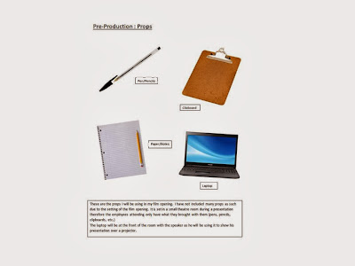
This is the Production Schedule for my film opening. This will help me organize my production into manageable parts while filming.
Labels
- Coursework (3)
- Evaluation (9)
- Final Production (2)
- Pre-Production (22)
- Preliminary Task (3)
- Theory (1)
Wednesday, 18 December 2013
Pre-Production Shot List
These are a list of shots I will be using for my film opening. This shot list will show me where the camera will be and what it should be doing during a particular shot and/or scene.
Tuesday, 17 December 2013
Pre-Production Floor Plan
These are the floor plans for my film opening. These plans will help me visualize where the camera and actors will be on the set during filming.
Monday, 16 December 2013
Sunday, 15 December 2013
Saturday, 14 December 2013
Script Second Draft
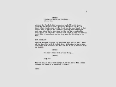
This is the second draft of my script. I found that the first draft of the script was too long and would never fit into the two minute time slot. I cut down most of the speaking in the scene and just featured the most important parts and dialogue of the script.
Friday, 13 December 2013
Friday, 6 December 2013
Target Audience
This is my target audience. I have used this to identify who my target audience actually are and what their interests, hobbies and age range is. Click on the picture for more information.
Thursday, 5 December 2013
Sci-Fi Genre Mindmap
I have generated a mind-map were I have collected my ideas about my film opening and incorporated them with how it is linked to a Sci-Fi genre.
I will allow me to identify what people expect to see in a Sci-Fi film so I can make my opening more appropriate for my target audience. Click on the picture for more information.
Friday, 29 November 2013
Fifth Film Analysis
Alien (1979)
This film is clearly a Sci-Fi film from the start due to the
opening being set in space. The music used in the opening also displays signs
of tense slow music, giving the impression that there may be something more
sinister going on. The slow editing adds to this tension and makes the audience
think that it is building to something bigger.
The characters are not seen in the first few minutes of the film, however their assumed costumes are present and the camera slowly pans around the spaceship. There are jumpsuits and spacesuits scattered around the wide shot giving a very strong impression of a sci-fi film.
As mentioned earlier, the way the camera pans around the ship is very slow and when accompanied by an equally slow and eerie soundtrack it gives the audience the impression of the suspense a horror film would give.
The colouring of the film is rather bland in the opening and feels cold. This gives quite an unnerving atmosphere for the audience and makes you feel as if you are in an uncharted area of outer space. These both give strong links to the sci-fi and horror genres letting the audience immediately identify what they are watching.
The lighting is low throughout the opening accentuating they are in space and gives the feeling of loneliness. There are also strong spotlights throughout the ships clean interior both giving the impression of what a futuristic spaceship may look like. This combined with an otherwise dark interior and almost silent intro give a tense scary atmosphere that gives the audience the vibe of a horror film. The sound of the computer turning on in the opening may cause some people to jump as it is a sudden jump in volume to the almost silent soundtrack, adding yet another layer of proof that this film will include horror.
Thursday, 28 November 2013
Fourth Film Analysis
Wall-E:
The opening of Wall-E starts with the camera slowly panning
through space giving the audience immediate indication that the film is leading
them into Sci-Fi territory. The editing then speeds up showing the camera
speeding down to what looks like a deserted, dusty uncharted planet, again
showing Sci-Fi elements. Bright ambient lighting presumably from the sun lights
up the planet after the camera has once again sped through the clouds.
The scenery shows huge pillars of what appear to be scrap metal towering above abandoned and dusty skyscrapers. These few seconds of the camera passing through the empty ‘city’ give a huge amount of information to the audience. The audience now know this will be a sci-fi movie as there is no way in real life scrap would be stacked so high giving the sense of the unreal to the audience. However what is most shocking about this scene is the realisation that this used to be the planet Earth now abandoned and left for dead. This gives the yet more evidence to the fact this is a Sci-Fi film due to the apocalyptic nature of the film.
The empty streets and junk piled high with a barren wasteland surrounding the former city is nothing like what the Earth looks like today, making the audience believe that they may be glimpsing into the future of the planet; all features of a Sci-Fi film.
The sound featured in the film is a quite breeze from the wind and the occasional ambient noise in the distance. This gives the sense of abandon and really adds to the apocalyptic nature of the film, being another Sci-Fi element.
Once the camera slows down with the editing pace, it lowers to the streets spinning and turning corners giving the impression the camera is exploring a new planet and it is not sure what it will find, adding to the Sci-Fi elements.
Perhaps the biggest giveaway that this is a Sci-Fi film is the fact the main character is a robot. Robots in films are almost exclusive to the Sci-Fi genre with very few exceptions.
This opening tells a big story about the state of the planet we are exploring in this Sci-Fi world without saying a word.
Third Film Analysis
2001: A Space Odyssey
A space odyssey first lets the audience it is a sci-fi film
purely from its title. Space is very rarely a touched upon setting for a film
unless you are making a Sci-Fi film.
The film shows what appears to be the sun rising over an unknown planet. The setting is therefore set in space, an obvious setting for a Sci-Fi film. The music playing during this slow edited scene gives the sense of discovery and mystery, giving the impression to the audience that they will be travelling deep into space and the unknown. Much of the other music featured in the film adds to the lack of gravity the actors are experiencing. Due to the light string instruments used to create the music it gives the feeling of weightlessness to the audience another key feature of being in space, which in turn is a key feature of a science fiction genre.
The film shows a space ship moving through space while keeping to the slow editing pace to perhaps replicate the slow moving nature of anti-gravity. The costumes the actors wear inside the ship also give large hints to a futuristic setting where space exploration is easy. All of these sci-fi elements point towards a fully engaging Sci-Fi film. Analysing the costumes more, the most obvious choice for identifying a Sci-Fi film would be the spacesuits worn by the crew aboard the ship. This lets the audience know they are in a space setting and therefore an almost obvious sense they are watching a Sci-Fi movie.
The pristine white walls of the interior of the spaceships are clear indication of a Sci-Fi setting being almost mandatory in all Sci-Fi films and being a clear giveaway to the genre of film being watched.
The camera angles used in the film commonly spin around the scenes to replicate the feel of no gravity and weightlessness, and to transfer it to the audience to make them feel like they are also in space.
The glowing lights featured in the spaceship are clear giveaways of a futuristic computer panel featuring a talking computer all clear signs of a Science Fiction setting.
Tuesday, 26 November 2013
Second Film Analysis
For my second film opening analysis of 'Identifying Genres' I chose Ghostbusters which is a Sci-Fi/comedy film.
Ghostbusters is a mix of action, comedy horror and sci-fi. This is identified by analyzing mise en scene, cinematography, sound and editing.
The setting portrays an overcast New York city with low colour tones and low light levels to suggest something scary or mysterious is going to happen soon. The props used suggest a mysterious tone such as using the psychic cards as a link to the paranormal.
Close ups of the actors is used commonly as it allows the audience to tell if the actors are scared or confused by the strange goings on or if they are saying something funny to see the reaction to the 'punchline.'
The Lighting used is quite low level to give a scary element as well as the purple light which is clearly a ghost. Ghosts are only seen in a select few genres of film. The main genres featuring ghosts are horror, thrillers and sci-fi. Ghostbusters has elements of horror and comedy in it so the audience know exactly what they are watching before the first three minutes of the film have finished.
During the scene through the library there are strange goings on such as books piling up and things flying off of shelves. This is particularly identifiable as a sci-fi elements as these things would not normally happen in real life.
The logo shown during the opening suggests yet again ghosts being featured in the film narrowing down the film genre. The font used with the logo is cartoony just like the ghost in the logo. This may suggest it could be a comedy film due to the light-hearted approach to the ghosts in the film.
The actor Bill Murray is known for his roles as a funny character so the audience know he will add an element of comedy to the film. The tense scary music at the start adds to the scary unknowing atmosphere of the opening.
During the library scene the camera follows behind the woman for a very long time all in one shot much like a ghost floating behind her to again show scary horror elements.
Wednesday, 20 November 2013
Preliminary Task Evaluation
After finishing my preliminary task I have written a short evaluation to sum up how everything went.
Overall I think my preliminary task turned out well. I think the hardest part was just coming up with an idea that would fit the specific task rules.
I decided on a short comedy scene that would be two people sat down having a conversation. This would allow me to easily get the 180 degree rule into my film and the match on action would be covered by someone coming through the door.
The best part of the task was the editing. Although I had little time due to the deadline, it was interesting to see what music went with my film and how setting the editing pace changes the film completely.
Overall I am happy with how the task turned out and am now turning my attention to the main Tasks pre-production.
I have also got a secondary opinion from a member of the class to quickly evaluate the technical details from my film:
''Stabilize the shots more, this can be fixed easily with a tripod. Good focus and the task rules were applied very well. Audio was clear but I feel the coloring of the shots were a little drab and under saturated.
Preliminary Task Idea
For my preliminary task my idea was to create a short comedic video that included:
A match on action shot, the 180 degree rule and a shot reverse shot.
I planned a short script to help with the acting and decided to improvise movement and gestures instead of a storyboard. I felt this would be easier as it was less time consuming and would have little effect on such a short film.
Below I have posted my script that I used in my preliminary task. Click on the picture for more information.
Tuesday, 19 November 2013
Identifying Film Genres
Today we watched the opening of 'Ferris Bueller's Day Off' so that we could identify the genre of the film using mise en scene, cinematography, editing and sound. For example we know that the film is a comedy due to the cheerful lighting that sets the first establishing shot. The main character frequently breaks the fourth wall, another common comedic value almost found exclusively in a comedy films.
For homework I need to find my own film opening and identify what genre it is using the 'Four technical elements' of media.
For homework I need to find my own film opening and identify what genre it is using the 'Four technical elements' of media.
Wednesday, 11 September 2013
Back to the Future
Today we watched the intro to 'Back to the Future' (1985) by Robert Zemeckis and produced by Stephen Spielburg. We analysed the shots and meanings of all the content in the film opening.
-The closeup and panning shots of the clocks show a man is obsessed with time ('Doc')
- Marty's character is not given away at first using low angle and P.O.V to hide his apperance.
- Marty is revealed with a clear medium shot.
- Establishing shot tells us we are in Hill Valley, America due to the clear signposting.
Different shot types
Different shots used by camera's
Establishing shot - Sets the scene

Long shot/ Wide shot

Close up

Extreme close up

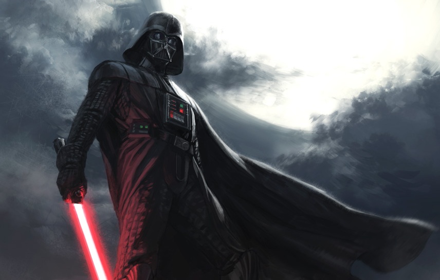
Low angle/worms eye - Looking up to show characters power or dominance
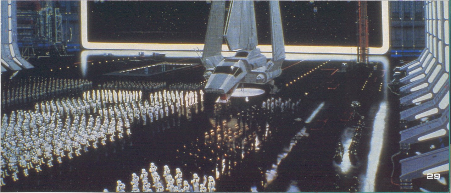
High angle/birds eye - Looking down to show upcoming bad events or to show weakness
![[star+wars+3.jpg]](https://blogger.googleusercontent.com/img/b/R29vZ2xl/AVvXsEg6G10JqReZSTo20mgN5m_CiFw78yKioB5GJ9FsLRjot9wJhzNqZlGQ3yHbgSF92TMcy1TWO6h6HiyH4wSI1SbFhihjz9TC1xkzNfyhr3rdxBosLPrZ-I4A2dQk7bcW1w66Aks8M5fvel4/s640/star+wars+3.jpg)
Canted angle - To show disorientation or tension
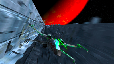
Pan left/right up/down

Shot reverse shot - The 180 degree rule

Establishing shot - Sets the scene

Long shot/ Wide shot

Medium shot

Close up

Extreme close up

Low angle/worms eye - Looking up to show characters power or dominance

High angle/birds eye - Looking down to show upcoming bad events or to show weakness
![[star+wars+3.jpg]](https://blogger.googleusercontent.com/img/b/R29vZ2xl/AVvXsEg6G10JqReZSTo20mgN5m_CiFw78yKioB5GJ9FsLRjot9wJhzNqZlGQ3yHbgSF92TMcy1TWO6h6HiyH4wSI1SbFhihjz9TC1xkzNfyhr3rdxBosLPrZ-I4A2dQk7bcW1w66Aks8M5fvel4/s640/star+wars+3.jpg)
Canted angle - To show disorientation or tension

Pan left/right up/down
Shot reverse shot - The 180 degree rule

Tuesday, 10 September 2013
This is where I will post all of my theory work for AS Media Studies
This is where I am going to post all of my AS Media Studies work.
Subscribe to:
Comments (Atom)


